|
[VIEWED 13412
TIMES]
|
SAVE! for ease of future access.
|
|
|
|
San

Please log in to subscribe to San's postings.
Posted on 02-10-14 4:16
PM
Reply
[Subscribe]
|
Login in to Rate this Post:
0  ?
? 
|
| |
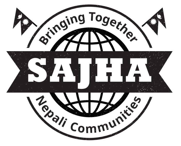
Which one do you like?
Number 1.

Number 2:

Number 3:
.jpg)
|
| |
|
|
|
|
Dinesh Shrestha.

Please log in to subscribe to Dinesh Shrestha's postings.
Posted on 02-10-14 4:35
PM [Snapshot: 15]
Reply
[Subscribe]
|
Login in to Rate this Post:
0  ?
? 
|
| |
Using the words "Nepalese Communities" would be better
|
| |
|
|
lopchandai.

Please log in to subscribe to lopchandai's postings.
Posted on 02-10-14 4:50
PM [Snapshot: 35]
Reply
[Subscribe]
|
Login in to Rate this Post:
1  ?
?  Liked by
|
| |
|
|
| |
|
|
Sparty

Please log in to subscribe to Sparty's postings.
Posted on 02-10-14 5:36
PM [Snapshot: 79]
Reply
[Subscribe]
|
Login in to Rate this Post:
1  ?
?  Liked by
|
| |
|
|
| |
|
|
Nevani

Please log in to subscribe to Nevani's postings.
Posted on 02-10-14 6:46
PM [Snapshot: 129]
Reply
[Subscribe]
|
Login in to Rate this Post:
1  ?
?  Liked by
|
| |
|
|
| |
|
|
jacksparrow

Please log in to subscribe to jacksparrow's postings.
Posted on 02-10-14 7:28
PM [Snapshot: 154]
Reply
[Subscribe]
|
Login in to Rate this Post:
1  ?
?  Liked by
|
| |
|
|
| |
|
|
ThahaChaena

Please log in to subscribe to ThahaChaena's postings.
Posted on 02-10-14 9:26
PM [Snapshot: 187]
Reply
[Subscribe]
|
Login in to Rate this Post:
1  ?
?  Liked by
|
| |
I like number 3 ....kinda feel on a white t-shirt number 2 might look better....
|
| |
|
|
helpjava11

Please log in to subscribe to helpjava11's postings.
Posted on 02-10-14 10:21
PM [Snapshot: 209]
Reply
[Subscribe]
|
Login in to Rate this Post:
1  ?
?  Liked by
|
| |
|
|
| |
|
|
OBAMA

Please log in to subscribe to OBAMA's postings.
Posted on 02-10-14 10:35
PM [Snapshot: 206]
Reply
[Subscribe]
|
Login in to Rate this Post:
1  ?
?  Liked by
|
| |
Dai, why do we need to have big logos like that? Why can't we have decent size sajha.com written followed by same size sajha flag in upper right corner of T-shirt, below which in smaller font: Bringing together Nepali communities a picture right in the middle much like u have in 3rd design or some kind of artistic representation of geography or culture. Big pictures and big bold letters are just awful in taste. I still have the old t-shirt u have sent me few years back. I had gone out with that T-shirt few times. In my experience, I already look and speak like foreigner and I don't want my T-shirt to scream that loud. Don't make it Ratnapark ko Wall ...pls instead of being message, lets be a messenger...I hope u understood, what I meant to say thank u dai.
Last edited: 10-Feb-14 10:36 PM
|
| |
|
|
San

Please log in to subscribe to San's postings.
Posted on 02-11-14 10:03
AM [Snapshot: 296]
Reply
[Subscribe]
|
Login in to Rate this Post:
0  ?
? 
|
| |
Thanks for all your feedback! Obama I agree with you regarding the big sajha block on the first design. The first two designs were made by someone else, and I designed the third one. It seems like the third one is doable after removing few things and keeping it simple. The 2nd one is in experimental stage.
|
| |
|
|
BathroomCoffee

Please log in to subscribe to BathroomCoffee's postings.
Posted on 02-11-14 12:15
PM [Snapshot: 331]
Reply
[Subscribe]
|
Login in to Rate this Post:
0  ?
? 
|
| |
Why not start a contest ? And let the community decide which one.. That would be the proper Sajha way of doing it..
|
| |
|
|
thukka

Please log in to subscribe to thukka's postings.
Posted on 02-11-14 12:29
PM [Snapshot: 343]
Reply
[Subscribe]
|
Login in to Rate this Post:
0  ?
? 
|
| |
may be you missing buddha in your third scratch
|
| |
|
|
bittertruth

Please log in to subscribe to bittertruth's postings.
Posted on 02-11-14 12:41
PM [Snapshot: 343]
Reply
[Subscribe]
|
Login in to Rate this Post:
3  ?
?  Liked by
|
| |
From design prospect ...... #2 is better than all but it serves no purpose on what and why you are wearing it and what does that symbol even mean. I know you are trying to promote Nepal and your site as well, this literature is based on that else, I would wear #2. #3 looks good on screen, but print? Believe me, you don't wanna see this on wrinkly shirts after couple of washes, it'd look worse than vintage wears tucked somewhere down in wooden chest. Why would anyone print full blown color image on shirt? They look disaster. #1 is the best of all. It has monotonal black, suitably looks good on shirts with various color tones and maintains fantastic contrast. It's sure to be gazed on if worn because of the appealing color contrast. And believe me, this won't look bad several washes later too. There could be more better options but out of 3, this design intern votes No. 1.
|
| |
|
|
Ghammad

Please log in to subscribe to Ghammad's postings.
Posted on 02-11-14 2:29
PM [Snapshot: 422]
Reply
[Subscribe]
|
Login in to Rate this Post:
0  ?
? 
|
| |
I have involved earlier in the work while designing the t-shirt for the nepalese association. Like here, we sought the input from all the people of the association. What I have realized that people usually like the simple and easily understandable to non-nepalese also. They usually want the blue and red color seen through it which are the color of our flag. I would go for first logo (if possible with red and blue color). As obama suggested, big logos do not look good. Thanks
|
| |
|
|
Kiddo

Please log in to subscribe to Kiddo's postings.
Posted on 02-11-14 3:01
PM [Snapshot: 452]
Reply
[Subscribe]
|
Login in to Rate this Post:
0  ?
? 
|
| |
I agree on keeping it simple. I liked Helpjava's 1st T-shirt with San's 2nd or 3rd logo in the right corner.
|
| |
|
|
playpause

Please log in to subscribe to playpause's postings.
Posted on 02-11-14 3:23
PM [Snapshot: 462]
Reply
[Subscribe]
|
Login in to Rate this Post:
0  ?
? 
|
| |
The first one is better but dont like the idea of the downward inclinement of the national flag.
|
| |
|
|
jobguruji

Please log in to subscribe to jobguruji's postings.
Posted on 02-11-14 4:02
PM [Snapshot: 476]
Reply
[Subscribe]
|
Login in to Rate this Post:
0  ?
? 
|
| |
San brother, we need more options...
|
| |
|
|
